The how to: methods and examples
The first aspect to be considered is the type of graphic most appropriate to illustrate your data. Many different graphs and other visual methods can be utilised. The most commonly used graphs include:
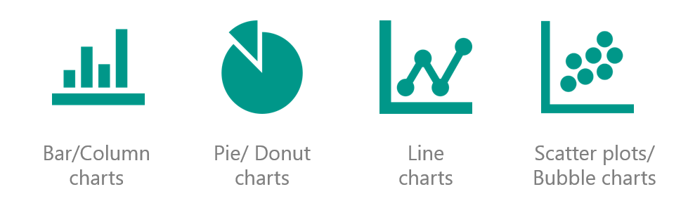
Each of these graphs can be used in several ways to display different types of data. Quick and easy changes to the standard format of these graphs can improve the appearance, making it more visually attractive and appealing to readers.
Axes & Units
An axis label is the title along the side of an axis that defines the data variable being depicted. The title works best when kept short and can be derived from your data table. On the chart, the font size should be easy to read but not dominate the graph. Avoid using abbreviations and acronyms even when providing data measure (kilometre instead of km), keep your axes labels clear and concise. Units refer to the numbers, percentages and figures displayed on the graph. Units are often shown on both the vertical and horizontal axes, these should always start at zero and increase/decrease in appropriate intervals.
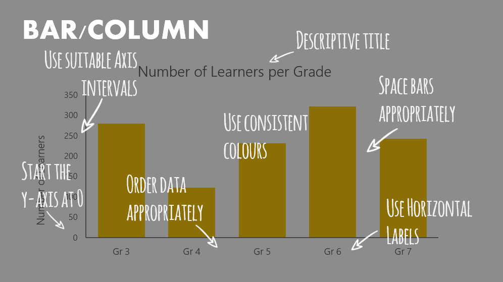
Labelling Data
Labelling data is one of the simplest ways of improving the appearance of your charts. Horizontal labels are easier to read. Label your data directly and use labels to highlight significant findings through colour and font.
Position and format
Positioning and formatting of your graph is key to its visual impact. This is the stage where you make your data beautiful. What needs to be considered is text, arrangement, colour and lines. Stephanie Evergreen’s Data visualisation Checklist clearly describes ways in which to improve your graph on these aspects.
Infographics
Infographics are essential for making data attractive and can include a number of different visualisations including graphs, charts, quotes, icons and pictures. Infographics use these elements combined with appropriate use of colour and fonts to present results and findings in a visually appealing graphic.
Infographics should:
- Be hand-crafted
- Be made for one specific dataset
- Be sensitive to context
- Tell a comprehensive story
- Guide the reader to conclusions
Common visualisation mistakes
- Don’t forget to provide context for your visuals and a supporting narrative.
- Avoid unsightly colour combinations.
- Don’t use illegible and distracting fonts.
Further online references and tools:
VISUALISATION EXPERTS
TOOLS
COLOUR
DESIGN-SEEDS
FONT
ICONS & PICTURES


Good Morning
My an MBA student due to commence on a Research Project (i.e Disertation).
Having viewed your services on the website, I thought I should contact you to find out if you could assist in the presentation of my research findings
My work number: 031-311 3589
My cell number: 0840637517
Regards
We will be in contact with you soon
Thanks for finally talking about > Data Visualisation: How to make data
attractive part 2 – Khulisa < Liked it!