#EvalTuesdayTip Data Viz Myth #1: Data Visualization Is About Displaying Data
[wpseo_breadcrumb]
#EvalTuesdayTip Data Viz Myth #1: Data Visualization Is About Displaying Data
First in a series of tips about data visualization (data viz) myths and how to avoid their pitfalls.
MYTH: Data Visualization is about displaying data.
TRUTH: Data Visualization is about making a point.
When communicating the findings of a study, it might seem tempting to lay out the results in a chart, label the bars or lines, and write a simple title above the chart: “Vaccine Hesitancy: Men vs. Women”, or “Vaccination Rates by Country”, etc.
But as Stephanie D.H. Evergreen, Ph.D., points out in her 2017 book, Effective Data Visualization: The Right Chart for the Right Data, we visualize data “because we have a point to communicate to the world. We have a compelling finding to share, a big idea revealed in our analysis that we need to say to people.”
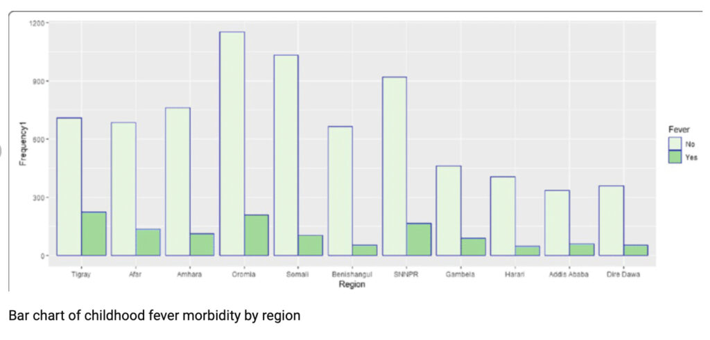
The bar chart below is an example of how not to visualize data.
A simple bar chart without a clear point (from BMC Public Health).
The title of a graph should have concisely communicated that graph’s most important point in a way that will draw in the reader. Instead of “Vaccine Hesitancy: Men vs. Women”, say “Men Are Significantly More Vaccine-Hesitant than Women.” The chart above should rather have the title, “Childhood Fever Morbidity is higher in rural areas of Ethiopia.”
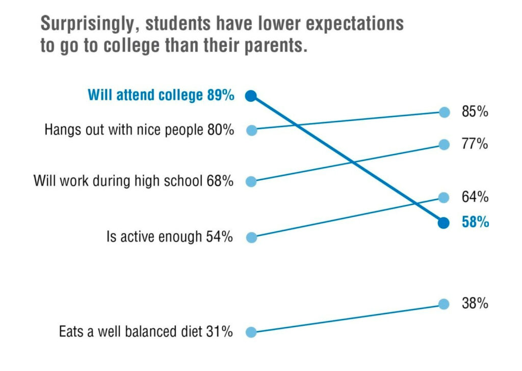
The next graph shows how to visualize data: make the point in the title
A bar chart that clearly communicates the point, from Effective Data Visualization: The Right Chart for the Right Data, by Stephanie D.H. Evergreen, Ph.D.