Second in a series of tips about data visualization (data viz) myths and how to avoid their pitfalls.
MYTH: Using jargon helps my data sound authoritative.
TRUTH: Data viz language should be plain and concise.
In our first Data Viz Myth tip, we emphasized the importance of making a point when describing data in a chart. In our second Data Viz Myth tip, we emphasize the importance of making that point with plain language.
It’s easy to slip into jargon – overly complicated language that may be difficult for a lay audience, or even a specialized audience, to understand – when discussing a topic you know well. But it’s always best to be clear and concise, no matter who your audience is. The easier it is to understand your data and findings, the easier it will be to use.
Using jargon that people don’t understand or have to Google may make them feel like they cannot understand or use your data, and prevent them from reading your report.
A term that seems simple to most evaluators, like “standard deviation”, might be incomprehensible to those outside the industry. Stephanie Evergreen, author of Effective Data Visualization: The Right Chart for the Right Data, suggests rewording “standard deviation” to “Where the core middle of our respondents fell” or “Most answers fell in this range.” “Margin of error” can be changed to “Our answers could be off by a few percentage points in either direction.”
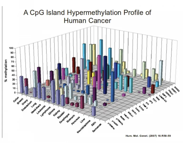
The graph below is an example of poor data visualization (the use of 3D also makes it difficult to read and understand) made worse with incomprehensible jargon. Data visualization should be making a point – not confusing the reader.
For more information about what jargon is and why/how to use plain language instead, check out this excellent U.S. government website: plainlanguage.gov.