Third in a series of tips about data visualization (data viz) myths and how to avoid their pitfalls.
MYTH: When visualizing a complex dataset, highlight as much data as possible in your graph.
TRUTH: Highlighting too much data in a single graph will look cluttered and confuse your audience.
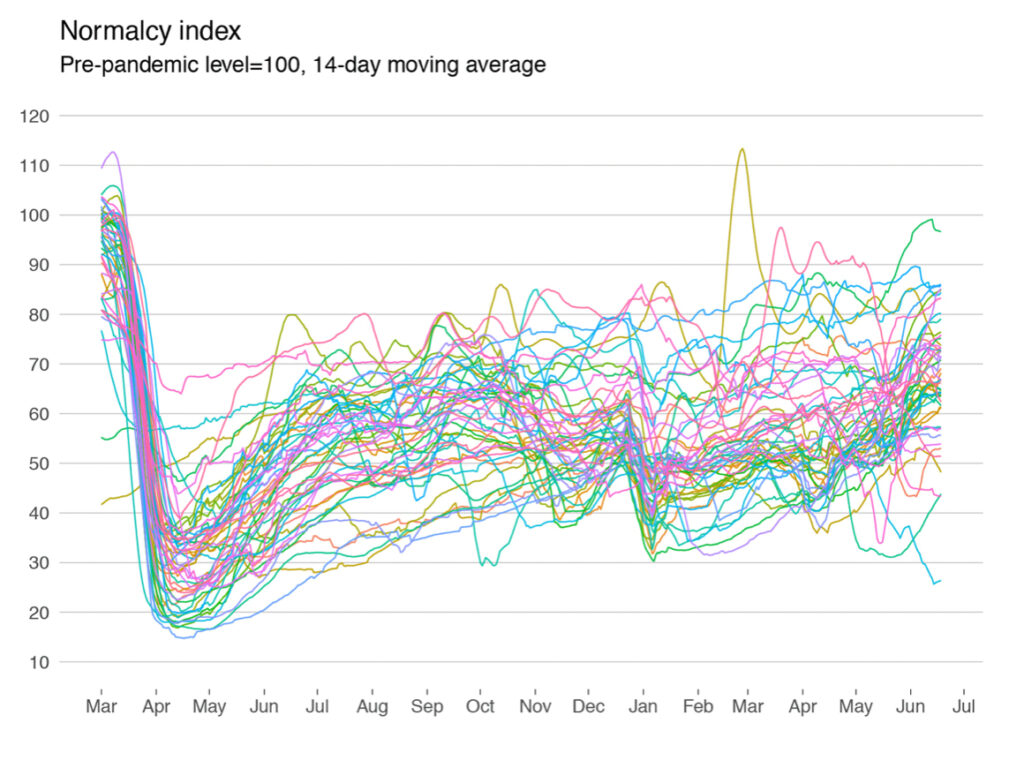
When data has an interesting story to tell, it’s natural to want to tell that story in as much detail as possible. But quantity does not necessarily mean quality in data viz. Graphs with too many lines/colors/data points are difficult even for experienced data professionals to understand. It’s important to minimize the clutter in your graphs as much as possible, highlighting a few key categories and de-emphasizing or eliminating the rest.
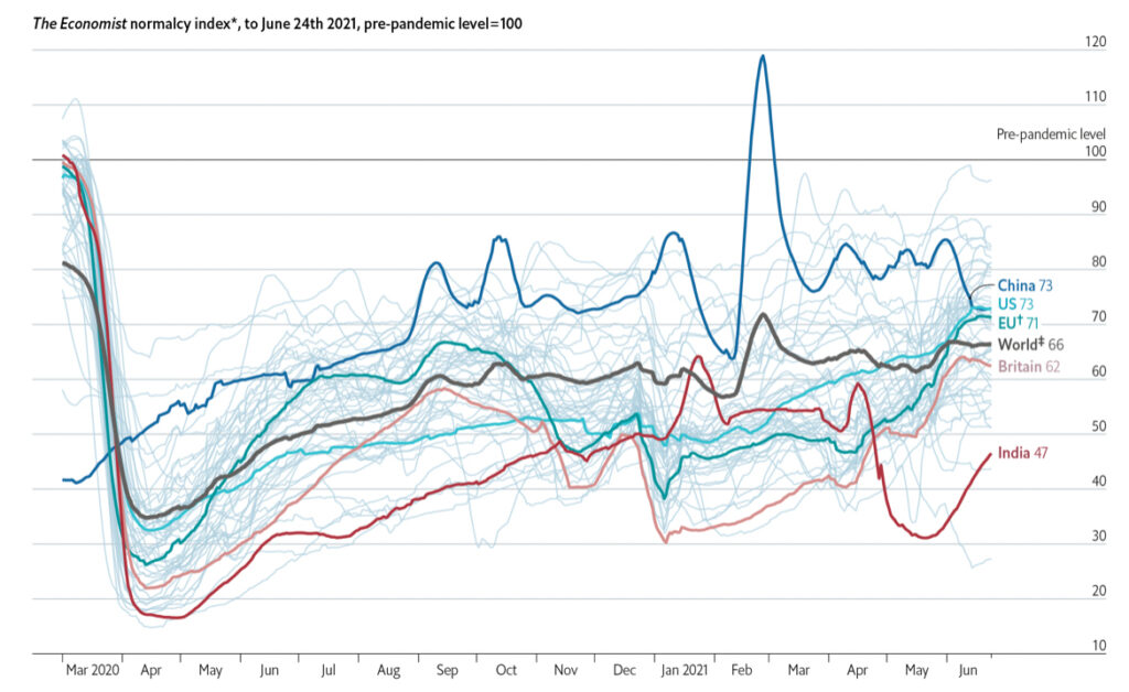
In an August 2021 piece in The Economist’s “Off the Charts” newsletter, data journalist Marie Segger provides a great case study in how to declutter a chart that visualizes a large number of categories. The Economist’s “normalcy index” tracks how 50 countries are returning to pre-pandemic life over time, based on eight different indicators. A line graph illustrating the data from all 50 countries is a tangle of colored squiggles, virtually impossible to make sense of.
To solve this problem, The Economist chose to highlight six lines – China, the United States, Great Britain, the European Union, India, and the world – in bold colors, while coloring the remaining lines in light gray so they fade into the background. The resulting decluttered graph tells a clear, compelling story: how “normalcy” plummeted worldwide in March/April 2020 and then slowly increased over the next 15 months, with a few hiccups and outliers.
When visualizing a large, complex dataset, remember that less is usually more. Look for innovative ways to declutter your graphs and tell an interesting story.