#EvalTuesdayTip, Data Viz Myth #4: Data Viz Is About Graphing and Charting Multiple Numbers
[wpseo_breadcrumb]
#EvalTuesdayTip, Data Viz Myth #4: Data Viz Is About Graphing and Charting Multiple Numbers
Fourth in a series of tips about data visualization (data viz) myths and how to avoid their pitfalls.
MYTH: Data viz consists of plotting multiple numbers on a graph or chart.
TRUTH: Data viz can be as simple as displaying a single number.
Last week’s data viz tip discussed the importance of decluttering graphs and charts as much as possible. This week’s tip takes decluttering to another level: Eliminating the graph/chart altogether and telling a story with a single, impactful number.
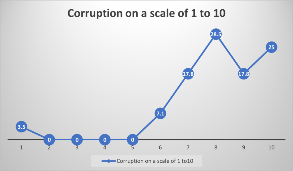
Sometimes more numbers tell less of a story. In a recent report, Khulisa needed to summarize the data collected from program beneficiaries on the perception of corruption in a particular organization. The data was collected by asking beneficiaries to rate their perception of corruption on a scale of 1 to 10.
Originally, the data
was displayed in a line graph:
There were 10 possible corruption ratings, and each blue dot on the graph represents one of those 10 ratings. But what is the point? Four of the 10 possible ratings received zero responses, and it’s unclear which of the other ratings one should focus on. The line graph doesn’t tell a clear story.
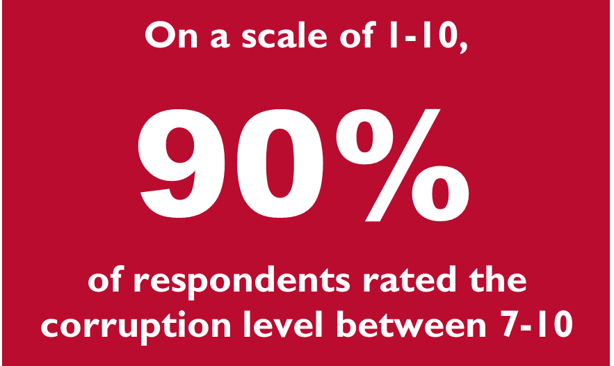
To remedy this problem, we decided to report the data through a single number:
Now the story is clear: Nearly 9 in 10 respondents rated corruption in this organization as very high. The clearer the data is, the more useful it is to demonstrate where change may need to occur.
Never underestimate the storytelling power of a single number.