#EvalTuesdayTip: Everything You Need to Know About Pie Charts
Date: January 9, 2024
For our first #EvalTuesdayTip of 2024, we’re sharing a great data visualization (data viz) resource from Excel Campus about when and how to use pie charts.
Source: Excel Campus
Pie charts are controversial among data visualization experts, with some advocating for sparing pie chart use and others advising to avoid pie charts at all costs. The Excel Campus article, written by Microsoft Excel MVP Jon Campora, takes the former position, suggesting, “Pie charts should be used about as often as you should eat pie: occasionally.”
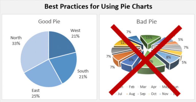
The article is comprehensive and a great resource for data viz beginners, first laying out exactly what a pie chart is and then establishing some basic rules for when pie charts are (and are not) appropriate, such as: A pie chart will only work when the data in question adds up to 100 percent.
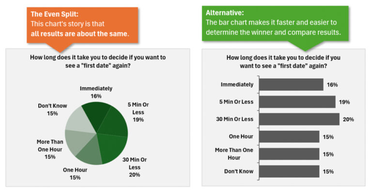
The article then illustrates seven examples of badly designed pie charts, and how each bad chart can be “made over” into a good chart – pie or otherwise. For example: Pie charts are hard to read when all the pie pieces are of similar size, and such charts often work better as bar charts.
Source: Excel Campus
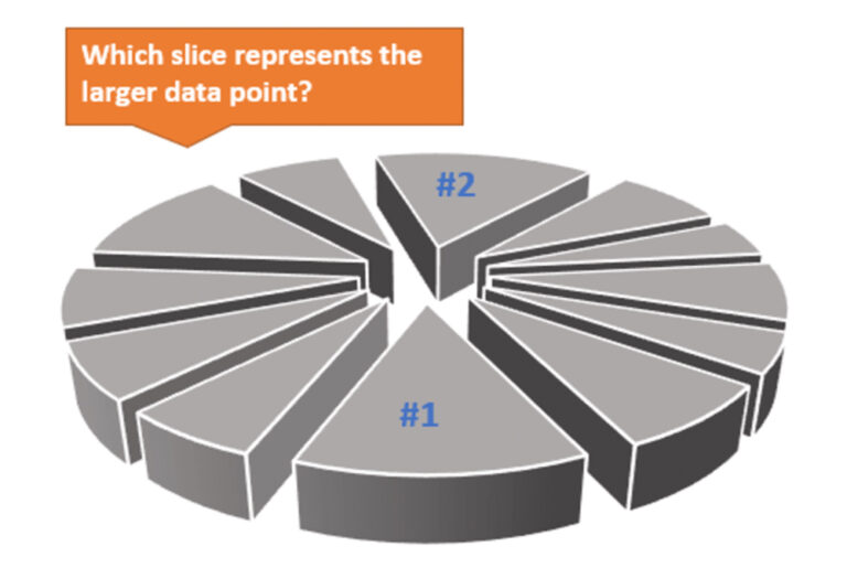
The post also emphasizes one of the most important laws of the pie chart universe: “Exploding 3D pie charts are always an absolute no,” unless your boss gives you no other choice.
Source: Excel Campus
“If your boss insists and you have to use [a 3D pie chart],” the article advises, “make sure you use the smallest number of slices possible and reduce the rotation so that you are looking at it from above rather than the side.”
This article is well-written, informative, and fun to read – a perfect way to start off your evaluation year.
We use cookies on our website to give you the most relevant experience by remembering your preferences and repeat visits. By clicking “Accept All”, you consent to the use of ALL the cookies. However, you may visit "Cookie Settings" to provide a controlled consent.
This website uses cookies to improve your experience while you navigate through the website. Out of these, the cookies that are categorized as necessary are stored on your browser as they are essential for the working of basic functionalities of the website. We also use third-party cookies that help us analyze and understand how you use this website. These cookies will be stored in your browser only with your consent. You also have the option to opt-out of these cookies. But opting out of some of these cookies may affect your browsing experience.
Necessary cookies are absolutely essential for the website to function properly. These cookies ensure basic functionalities and security features of the website, anonymously.
Cookie
Duration
Description
cookielawinfo-checkbox-analytics
11 months
This cookie is set by GDPR Cookie Consent plugin. The cookie is used to store the user consent for the cookies in the category "Analytics".
cookielawinfo-checkbox-functional
11 months
The cookie is set by GDPR cookie consent to record the user consent for the cookies in the category "Functional".
cookielawinfo-checkbox-necessary
11 months
This cookie is set by GDPR Cookie Consent plugin. The cookies is used to store the user consent for the cookies in the category "Necessary".
cookielawinfo-checkbox-others
11 months
This cookie is set by GDPR Cookie Consent plugin. The cookie is used to store the user consent for the cookies in the category "Other.
cookielawinfo-checkbox-performance
11 months
This cookie is set by GDPR Cookie Consent plugin. The cookie is used to store the user consent for the cookies in the category "Performance".
viewed_cookie_policy
11 months
The cookie is set by the GDPR Cookie Consent plugin and is used to store whether or not user has consented to the use of cookies. It does not store any personal data.
Functional cookies help to perform certain functionalities like sharing the content of the website on social media platforms, collect feedbacks, and other third-party features.
Performance cookies are used to understand and analyze the key performance indexes of the website which helps in delivering a better user experience for the visitors.
Analytical cookies are used to understand how visitors interact with the website. These cookies help provide information on metrics the number of visitors, bounce rate, traffic source, etc.
Advertisement cookies are used to provide visitors with relevant ads and marketing campaigns. These cookies track visitors across websites and collect information to provide customized ads.