By Tamar Boddé-Kekana
Last week’s tip discussed how to start making a great evaluation conference poster: some questions to ask yourself before you begin designing the poster and general parameters to keep in mind in the early stages. This week, we’ll get into the details.
Poster Design Software
Your first questions might be: Which software should I use to design my poster? The simplest options are:
· PowerPoint, which works well and is easy to use; and
· Canva, which has a lot of design options and is transferrable to PowerPoint.
However, PowerPoint and some functionalities of Canva require subscriptions. Open-source (i.e. free) alternatives to these programs include:
· OpenOffice, the free alternative to Microsoft Office, which includes Impress, the OpenOffice alternative to PowerPoint;
· Inkscape and Gimp, which are alternatives to the Adobe products; and
· Gliffy or Lovely Charts for creating charts and diagrams.
· Here is a complete list of free graphics software programs.
(Credit for above list of open-source options: https://guides.nyu.edu/posters)
PosterPresentations.com provides several free PowerPoint poster templates in various sizes.
How to Avoid a Crowded Poster
As we discussed last week, it’s tempting to fill your poster with as much information as possible. But overly full posters are difficult, if not impossible, to read.
To avoid overcrowding, follow these guidelines:
· Let the title span almost the entire poster width;
· Use a grid to keep items aligned and straight;
· Use text hierarchy (titles larger than regular text, etc.);
· Use a simple, readable, and large font and no more than 3 fonts per poster;
· Don’t include an abstract;
· Use a column format and try to keep around 40% of poster clear of text and images;
· Limit use of boxes and lines;
· If items go together – put them close to each other; and
· Maintain a colour scheme and keep backgrounds subtle.
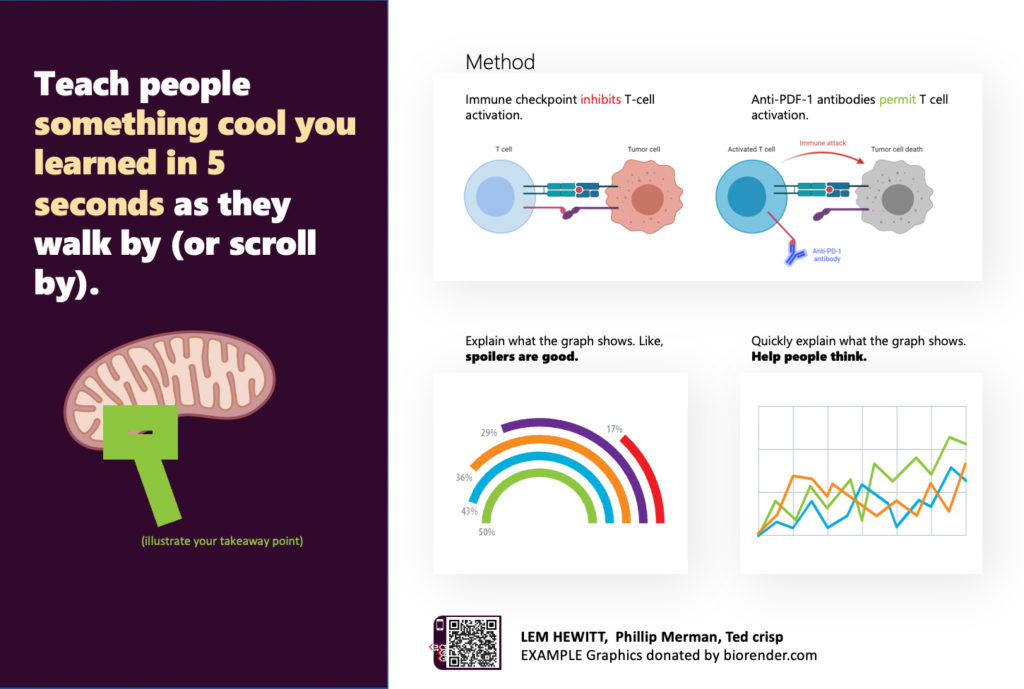
Source: Better Scientific Poster Project by Mike Morrison (https://osf.io/ef53g/)
What Makes a Good Poster?
While it’s tempting to squeeze as much information as possible onto a poster, this strategy won’t work for viewers with limited time. The best posters summarize information concisely and attractively using a mixture of brief text, tables, graphs, and/or pictures. Here are a few guidelines:
• Important information should be readable from about 3 meters (or 10 feet) away.
• Title should be short, evocative and draw interest.
• Word count should range between 300 to 800 words.
• Text should be clear and to-the-point.
• Use bullets, numbering, and headlines for easy reading.
• Use effective graphics, colors, and fonts.
• Create a clean, consistent layout.
• Include acknowledgments, your name, and your institutional affiliation.
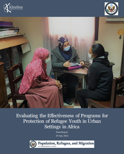
For more on how to make a great evaluation conference poster, check out Khulisa evaluator Jennifer Bisgard’s tips at the end of this story about the 2019 African Evaluation Association Conference.
How to Begin?
Before starting work on your poster, think carefully about what you want to say. Who is your audience and what is the story you want to tell them? If you had to explain your research or issue in 20 words or less, how would you do it?
Then ask yourself three more questions:
1. What is the most important/interesting/astounding finding from my research project?
2. How can I visually share my research with conference attendees? Should I use charts, graphs, photos, and/or images?
3. What kind of information can I convey during my talk (if applicable) that will complement my poster?
Keep these questions in mind as you design your poster to help you stay on track.
Next week’s #EvalTuesdayTip will discuss specific design and layout tips for making a great poster.