We recently discovered a great article about qualitative charts by Stephanie Evergreen, one of the evaluation world’s foremost experts on data visualization, which explains several innovative ways of visualizing qualitative research findings. Last week’s EvalTuesdayTip featured heat charts, or heat tables. Today’s tip features an unconventional take on one of the most conventional data viz techniques: word clouds.
“…if you’re still holding on to your good ol word clouds, let me offer this adjustment: the most insightful word clouds come in pairs,” Stephanie writes. “It’s in the comparison that we’re able to construct some meaning.”
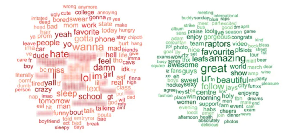
Side-by-side word clouds, created by Evergreen Data.
The circles above illustrate common words used in tweets by Americans and Canadians, respectively, with the most inappropriate words – all on the American side – blurred out. (“I bet you can tell which word cloud belongs to which group,” Stephanie quips in her article.) As the article points out, looking at the two word clouds together is far more powerful and illustrative than looking at either cloud on its own.
“Word clouds have more storytelling power when we use them in a comparative sense,” says Stephanie.
Read some of our previous #EvalTuesdayTip about data visualization here, here, and here.