Communicating information clearly and effectively is key to successful reporting in the monitoring and evaluation field. Data visualisation can be used as a technique to visually communicate information by presenting data in a graphical format. Because of the way the human brain processes data, using an infographic instead of a spreadsheet allows people to grasp the meaning of the data faster. This blog presents quick and simple methods to use data visualisation; how to transform statistics and findings into visual stories.
What is data visualisation?
Data is all around us and has been for a very long time. Historically, data was used in small extracts to visually illustrate and expand our understanding of the geographical world. Early forms of data visualisation can be found in the form of maps and graphs dating back to the 1600’s.
Data Visualisation is defined as a process by which data is presented in a visual or graphical format. The goal is to effectively communicate information to a diverse audience, in the form of visual data which is easily consumed and digested.
In order to succeed in visualising data, there are many factors to consider. This includes; knowing your data, understanding the power of visuals as well as learning how to create appropriate graphics. It is also important to be aware of common data visualisation mistakes to avoid.
Why use visuals and graphics
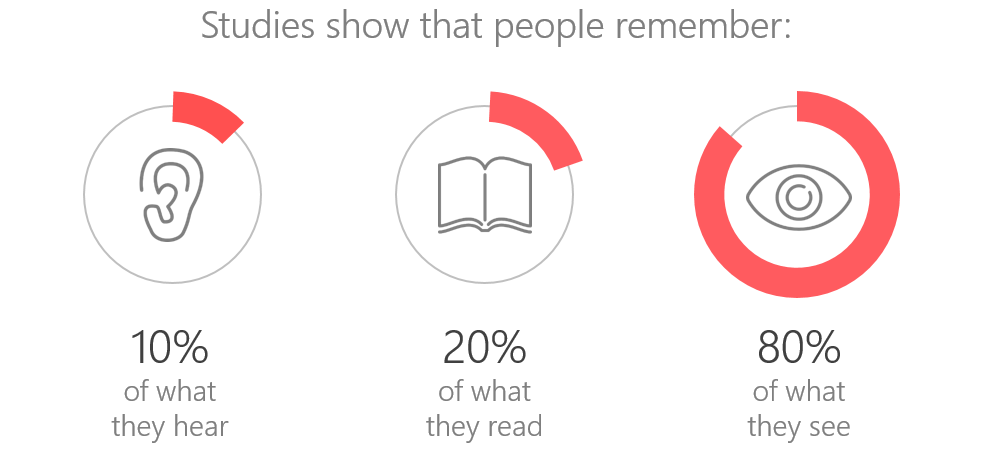
Psychologist Albert Mehrabian demonstrated that 93% of communication is nonverbal. Research has also shown that 80% of people remember what they see and do quicker than what they hear. Visual stimulants are processed up to 60, 000 times faster than text.
With the increase in the use of graphics to disseminate information, reporting is in the process of a transformation. This involves the use of creative visuals to produce attractive reports, grabbing the attention of readers and ensuring that findings are not ignored.
Communicating data using visuals allows evaluators to showcase trends, correlation and outliers in interesting ways. It also draws attention to the differences which exist in comparative data. Findings can be conveyed using numbers, but to highlight certain results, visuals drive the message.
Overall the advantage to using visuals is that they are more easily consumed and understood by a wider range of people.
Know your data
To accurately create visualisations, it is important to understand your data. This involves identifying the types of data that can be visualised, ensuring that your data is consistent and accurate as well as aggregating data to discover trends, correlations and outliers.
Data types
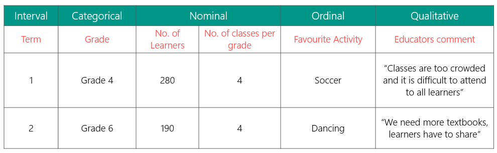
It is necessary to know the type of data you are working with as it determines how it can be visually communicated. Basic data groups include; quantitative (nominal, ordinal, interval and ratio), qualitative and categorical.
The table below shows the different data types and how they interact.
Data cleaning and aggregation
Data should be collected and processed thoroughly to ensure consistency which will produce accurate results for analyses. Aggregation of data is necessary to identify patterns in your data which translate into key findings. These processes are necessary to isolate key messages to highlight using appropriate data visualisation.
Knowing your data helps with deciding which and how much data to illustrate when creating a visualisation. Consider these three questions: What do I know about my data, what do the findings mean, is it important to communicate?
In the next part of this blog we will address the how-to’s of presenting better